Summary
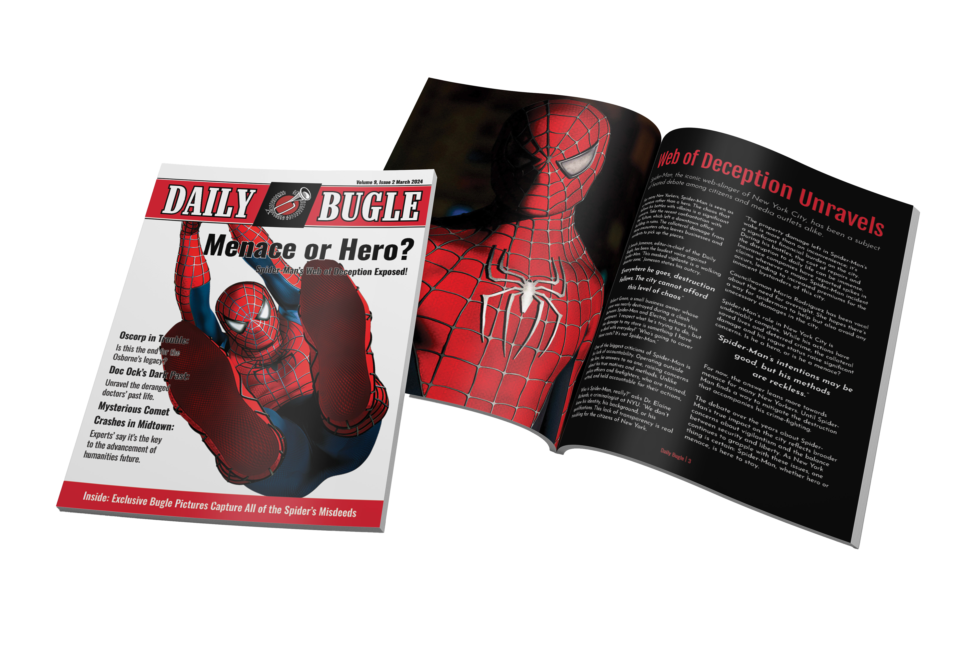
Being a huge supporter of Sam Raimi's Spider-Man films growing up, the first trilogy served as inspiration for this project. My goal was to produce a magazine that follows the plot points of the movies, giving readers a sense of continuity and immersion, giving the readers the impression this is set in the same universe as the films.
Programs Used
Adobe Indesign, Photoshop & Illustrator.
Colour Palette
emulated the colour schemes of the newspaper company that served as the model for this magazine, maintaining faithfulness to the original source. This was achieved by conducting research, exploring various comic book sources, and selecting colour schemes that are consistent and align with those found across most editions.

Typography
The magazine features a combination of three typefaces to achieve a balance of legibility, boldness, and a touch of nostalgic charm. Oswald is used for the bold cover headers, Josefin Sans for the body text, and Fjalla One for the body headers and sub headers.
Content Selection
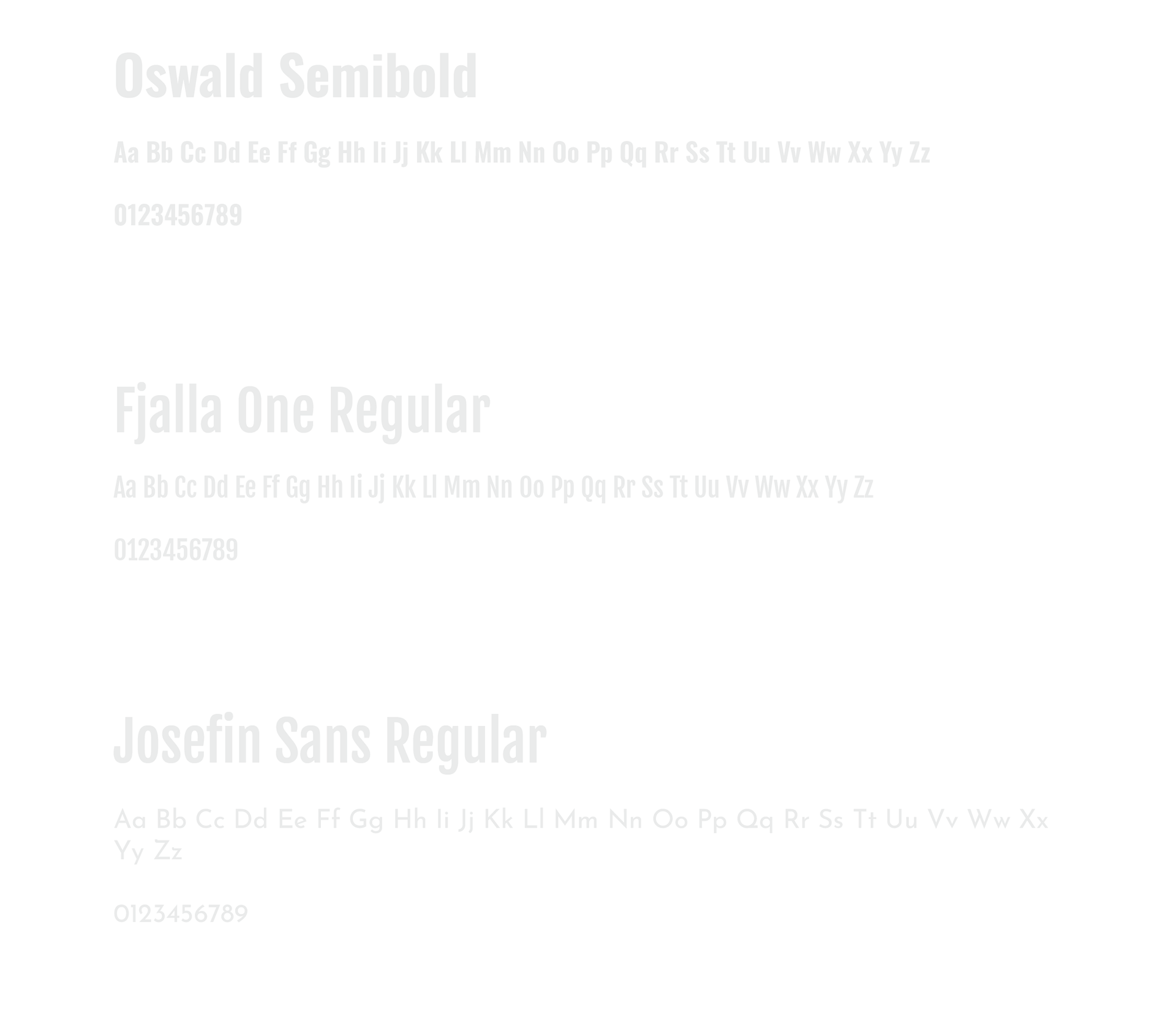
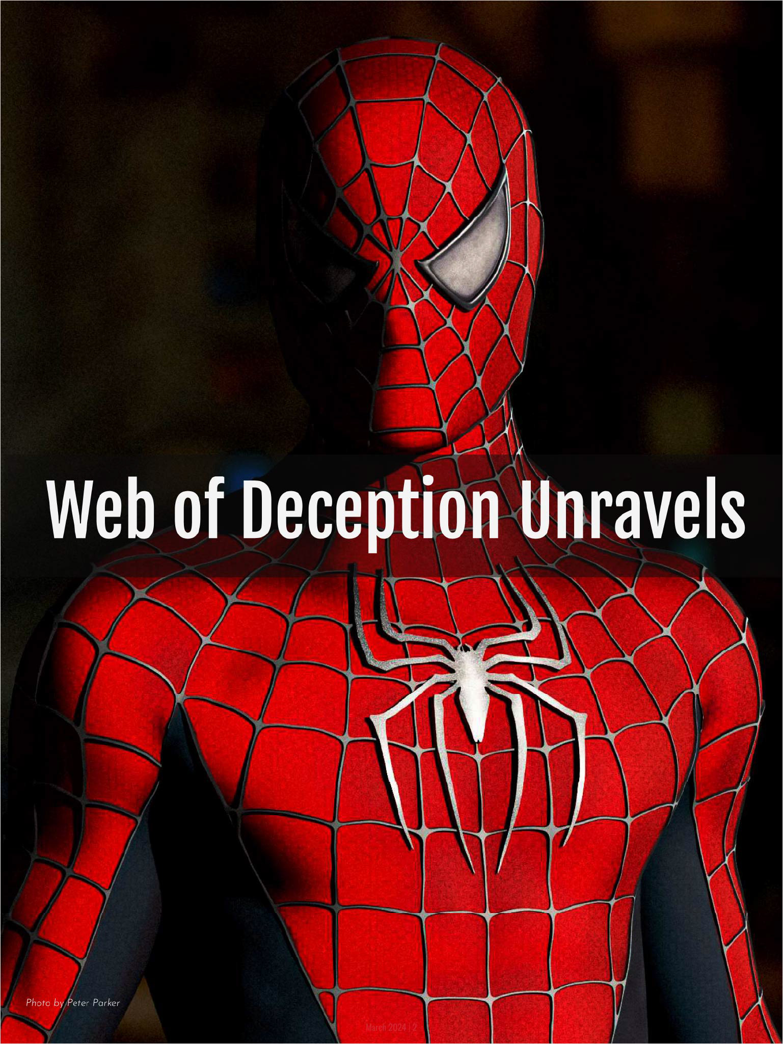
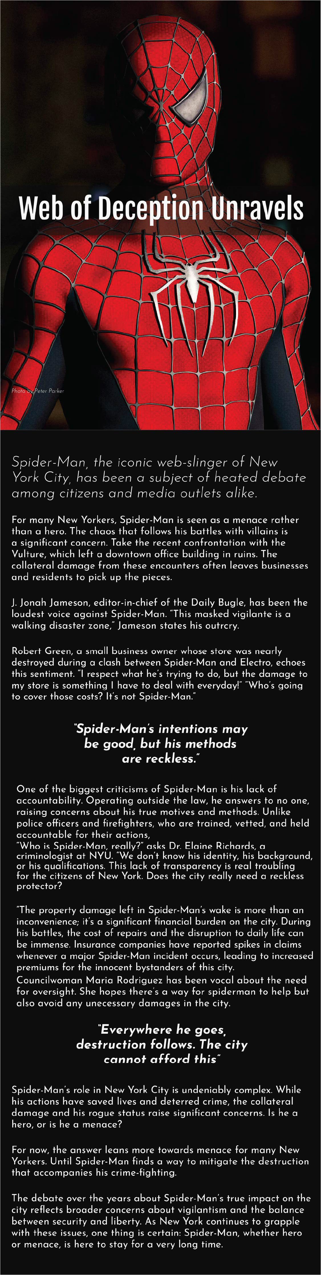
Close-up shots from the movies were used to mimic the look of newspaper photos, making it easier to catch the reader’s eye before diving into the heavier text. The text itself ties in with the editor’s usual disapproval of Spider-Man, keeping things on theme. It adds a fun layer of familiarity for anyone who’s seen the films, making the whole piece feel more connected.
Layout Style
a newspaper-style layout was used with large, bold headers to grab readers' attention as they open the magazine. the text is neatly aligned for easy readability, with minimal distractions to keep the focus on the content. images are placed either above or beside the text, guiding readers through the layout and mimicking the classic flow of a newspaper format.
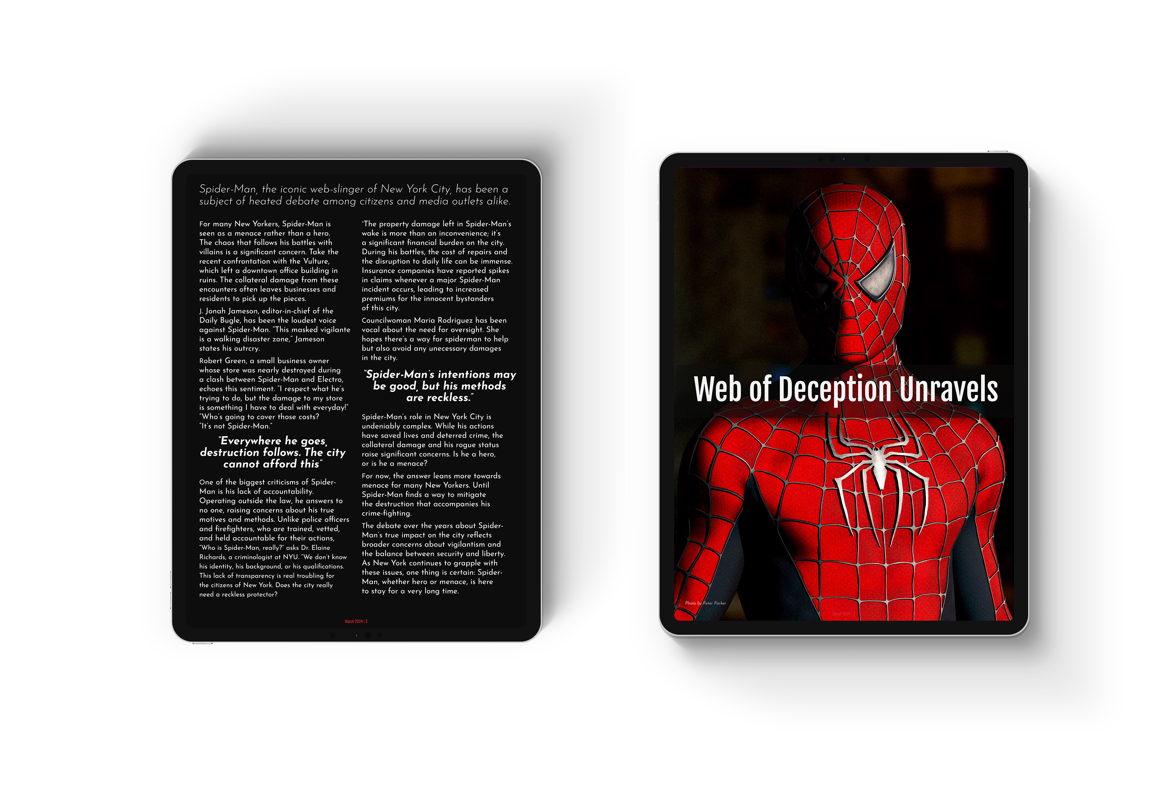
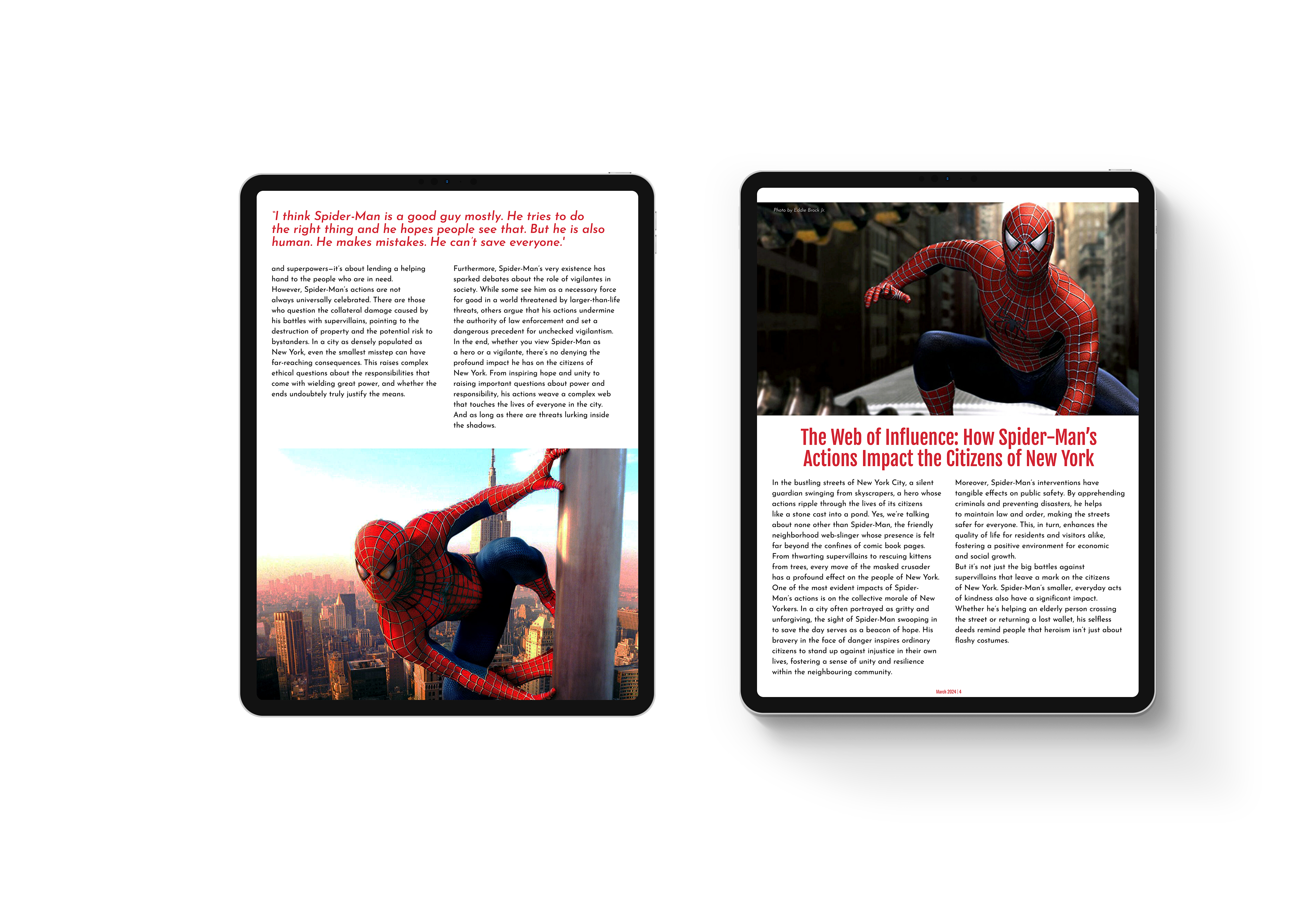
Tablet Version
Some headers are placed directly over images to save space, but overall, the tablet version closely mirrors the print layout—aside from the flat, full spread being adapted into two separate pages.
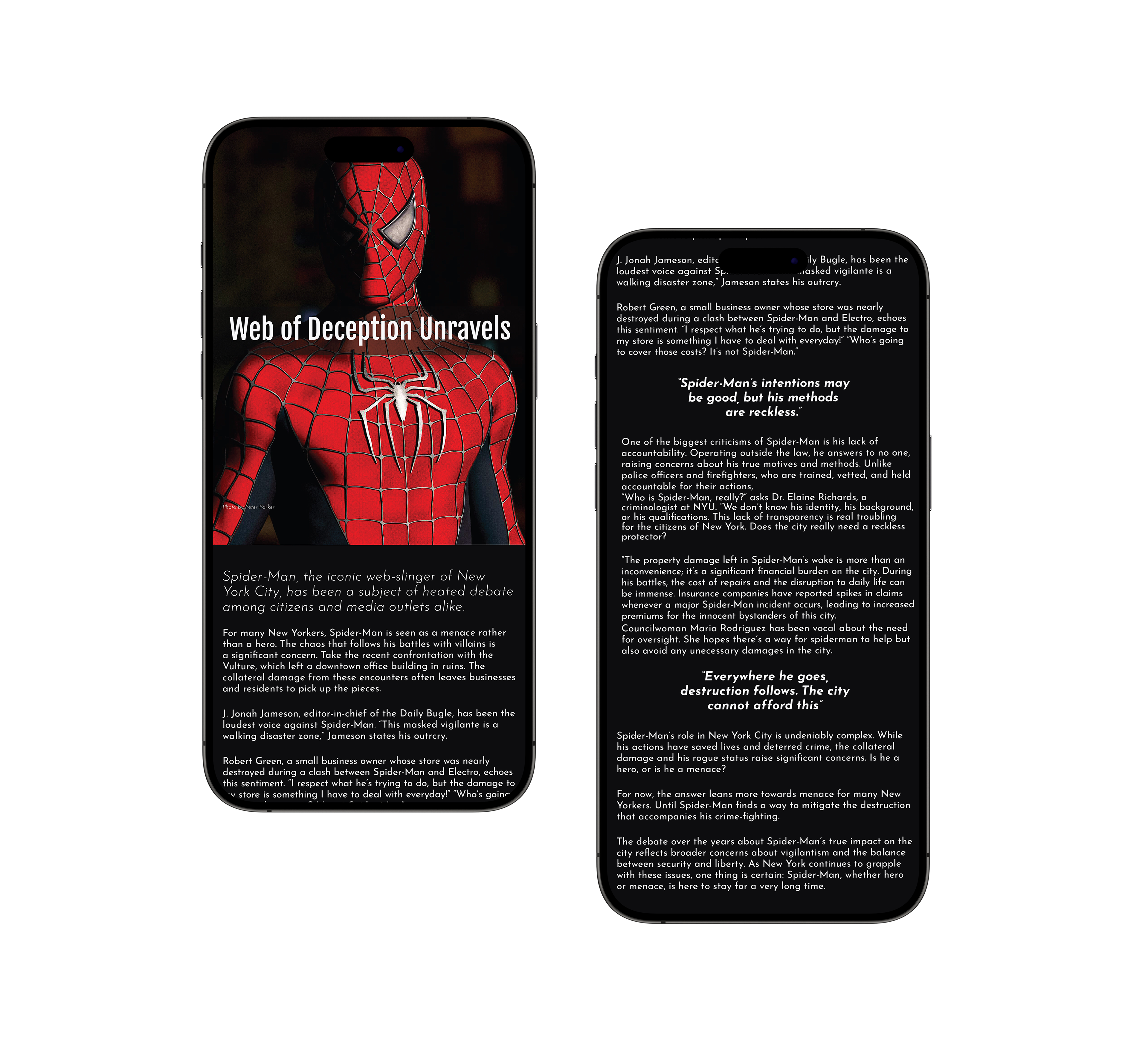
Mobile Version
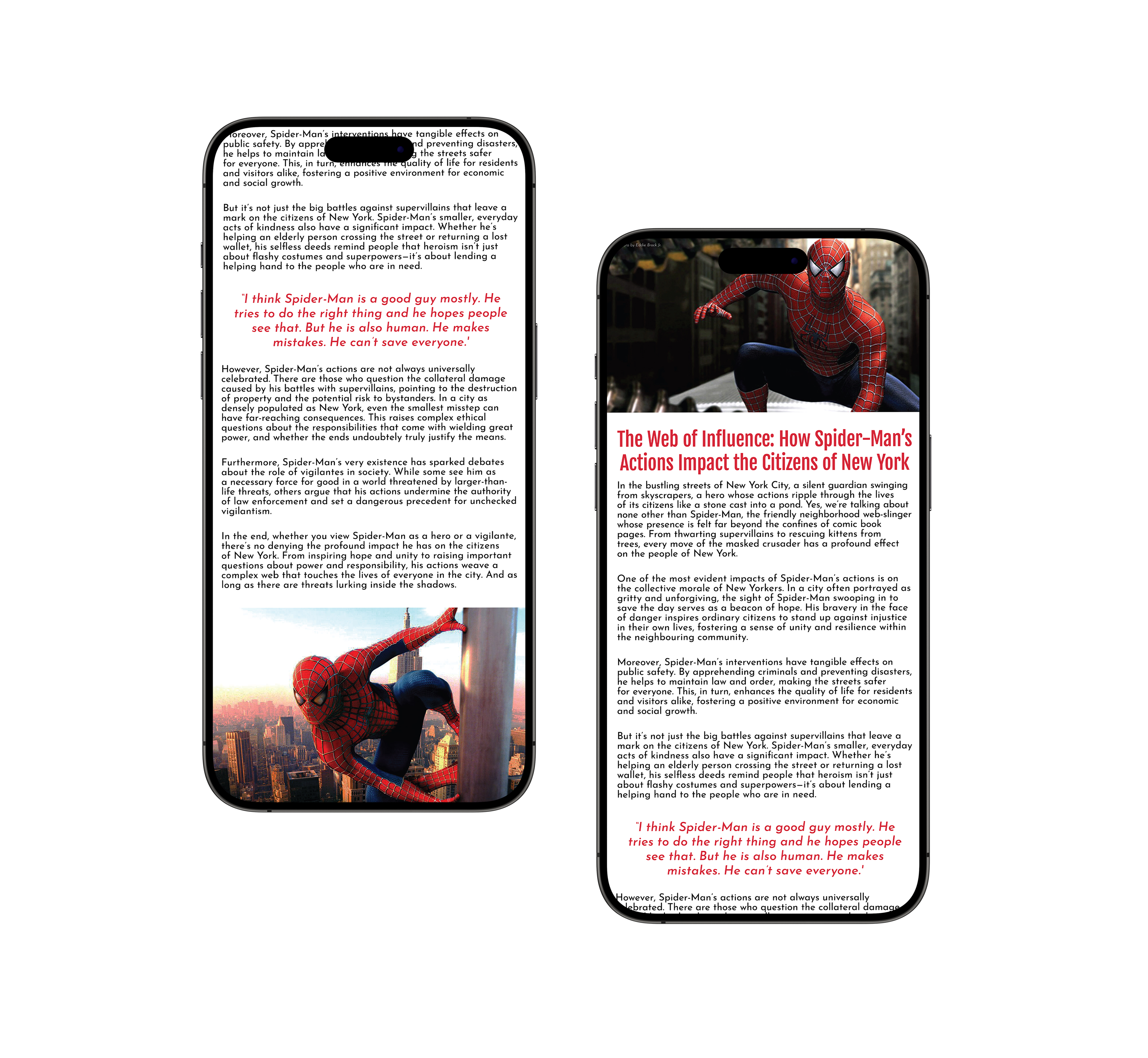
Images are used to mark the beginning and end of each page in the mobile version, with text placed between them to create a clear, continuous scroll that minimizes distractions and enhances readability.
magazine cover

Print Flats

Tablet Flats

Mobile Flats

Mockups